
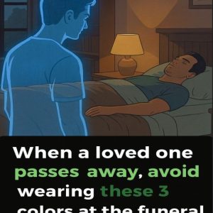
Funerals are moments shaped by reflection, remembrance, and quiet solidarity, and what we wear plays a subtle but meaningful role in that setting. Clothing becomes a form of nonverbal communication—an expression of empathy toward grieving families. While customs vary across cultures and beliefs, many communities share a common expectation: funeral attire should be understated, respectful, and free from distraction so the focus remains on honoring a life.
For this reason, certain colors are traditionally avoided. Bright red is one of the most discouraged choices, as it is widely associated with celebration, passion, and high energy. Its intensity naturally draws attention, which can feel out of place in a solemn environment. Unless a family specifically requests red for cultural, symbolic, or personal reasons, choosing a more subdued color is generally considered a thoughtful gesture.
The same principle applies to vivid or neon shades. Colors like electric pink, bright yellow, vivid orange, or lime green tend to evoke cheerfulness and playfulness—emotions better suited to festive occasions. In a memorial setting, such colors can unintentionally shift attention away from remembrance and toward the wearer, even when no harm is intended.
Dark, muted tones help maintain the tone of the day. Black, navy, charcoal, deep gray, and soft browns allow you to be present without standing out. It’s also wise to avoid shiny or metallic fabrics, as sequins, glitter, and reflective materials can feel celebratory. Simple silhouettes, modest styling, and minimal accessories communicate quiet respect. When in doubt, choosing calm, neutral colors ensures the moment remains centered on compassion, remembrance, and support for those who are grieving.